Madewell is a clothing brand that believes in elevated design by tapping into millennials' obsession with vintage aesthetics. The brand has a timeless, unexpected, and refined look. They also work with influential people such as musicians, and designers to help inspire your look.
MADEWELL
PROJECT OVERVIEW
The goal was to create a prototype for the Madewell website to improve user experience. By analyzing the typical user and their journey it provides insight on how to refine their shopping experience. After examining and determining which areas of the experience needed improvement I created a prototype, preformed a testing survey, and gathered the results to determine customer satisfaction.
INITIAL UX ANALYSIS
Through my initial analysis I determined there were a few key areas I could improve. The important information was too small and compact, and the pages were over-categorized, and inconsistent.
The mobile version had the same key usability issues. The only added drawback was the hierarchy of information.
After my analysis I knew there were many ways I can streamline, better organize, and reduce content to improve this shopping experience.
USER PROFILE & USER JOURNEY
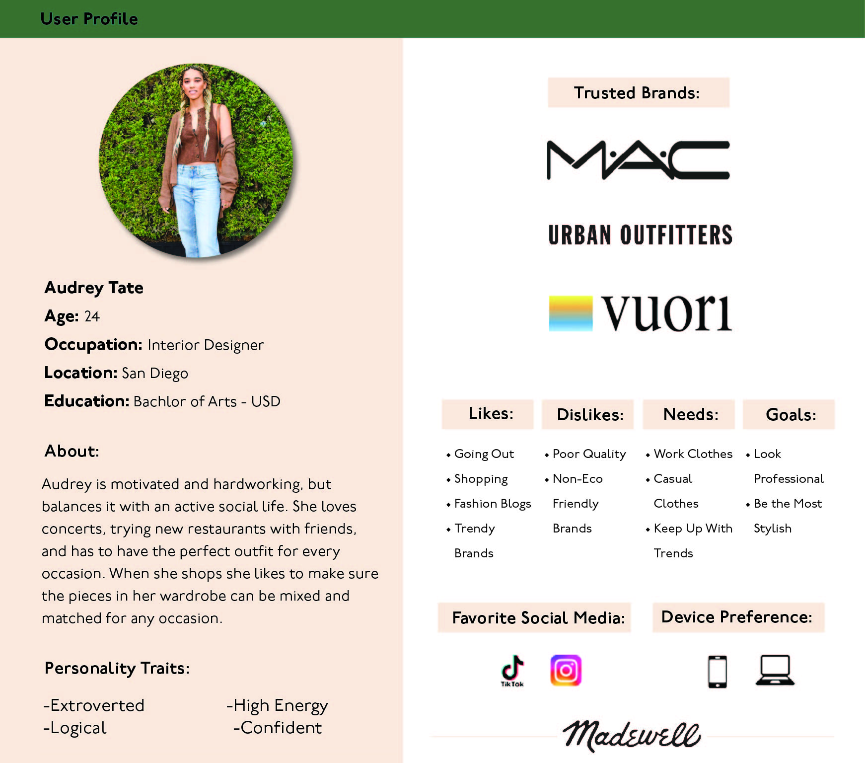
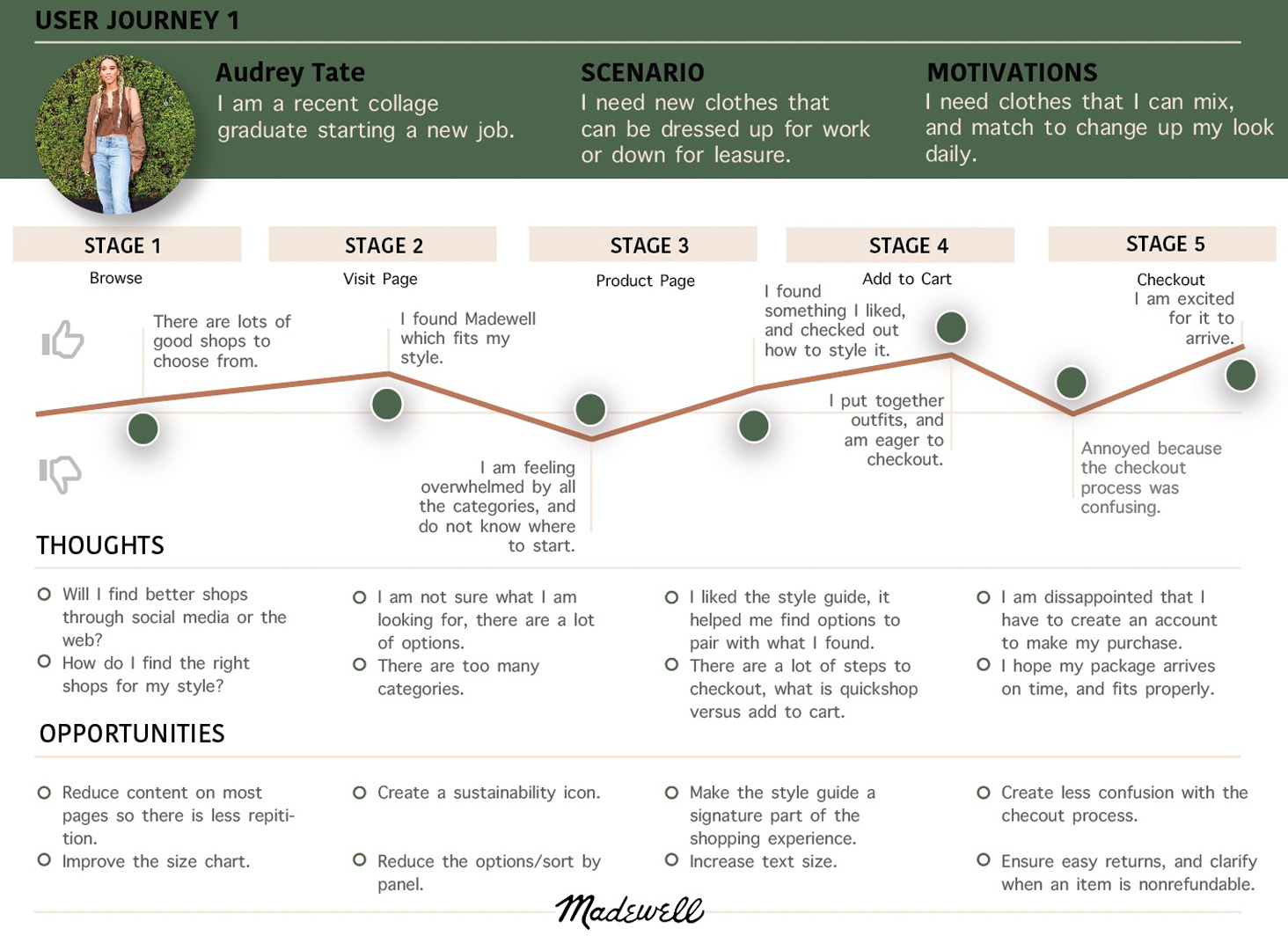
The user profile is used to gauge the average Madewell shopper. Their user journey provides insight on their online shopping experience.
PROTOTYPE IMPROVMENTS
BEFORE
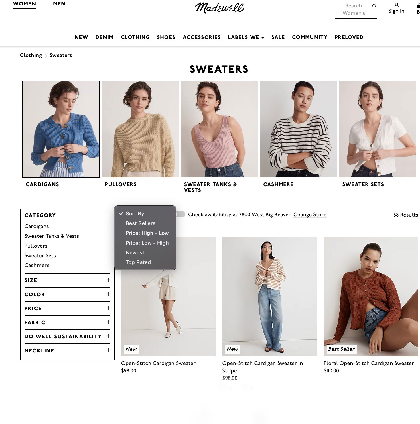
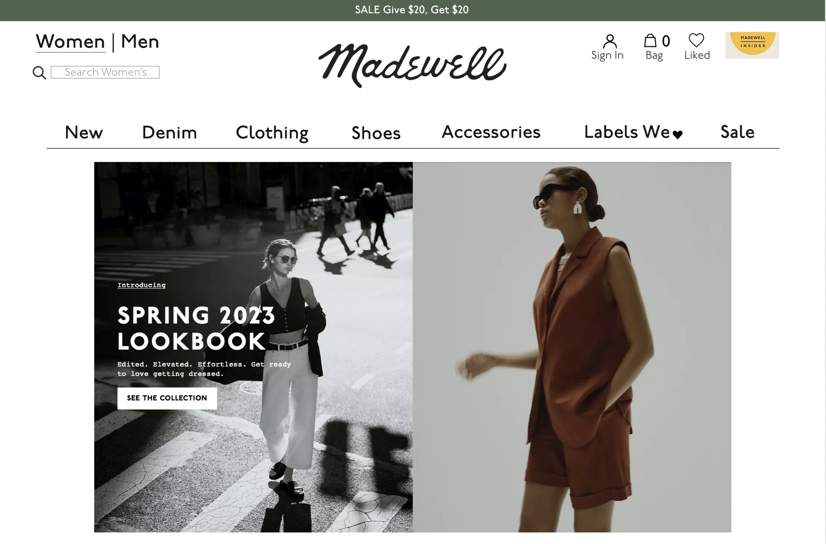
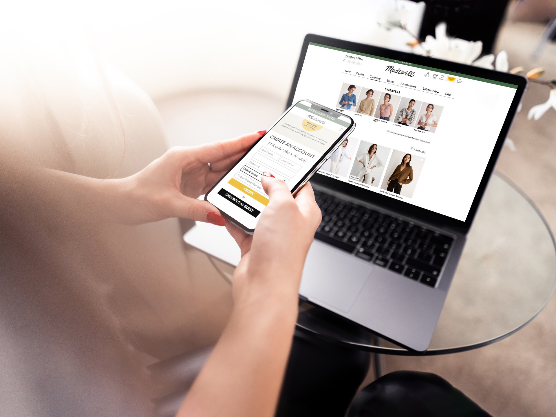
There is an overuse of categories causing a lot of unnecessary redundancy. The categories are listed at the top, and have two other side menus with the same information. This should be reduced into one menu.
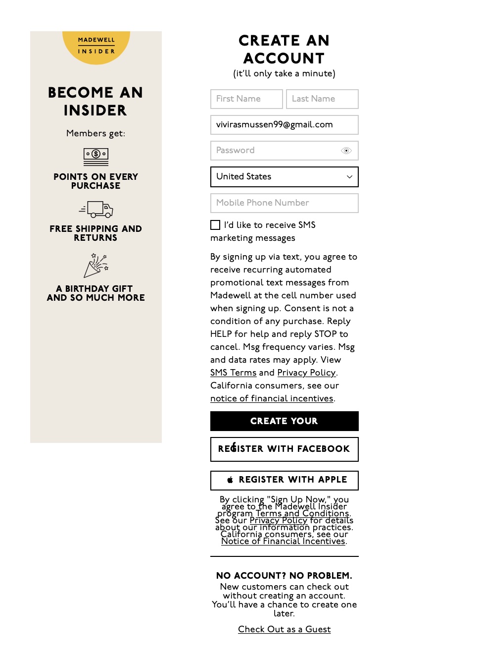
When you press checkout this is where your journey on the Madewell site takes you. At first glance it seems that you must become a member to proceed. It is proven that people will back out of their purchase at this point in the checkout process if they feel they are forced to make an account. As you can see after the long text excerpt with a lack of proper spacing, that at the very bottom you can if fact checkout as a guest. It is important that the user never feels deceived during their shopping experience.
AFTER
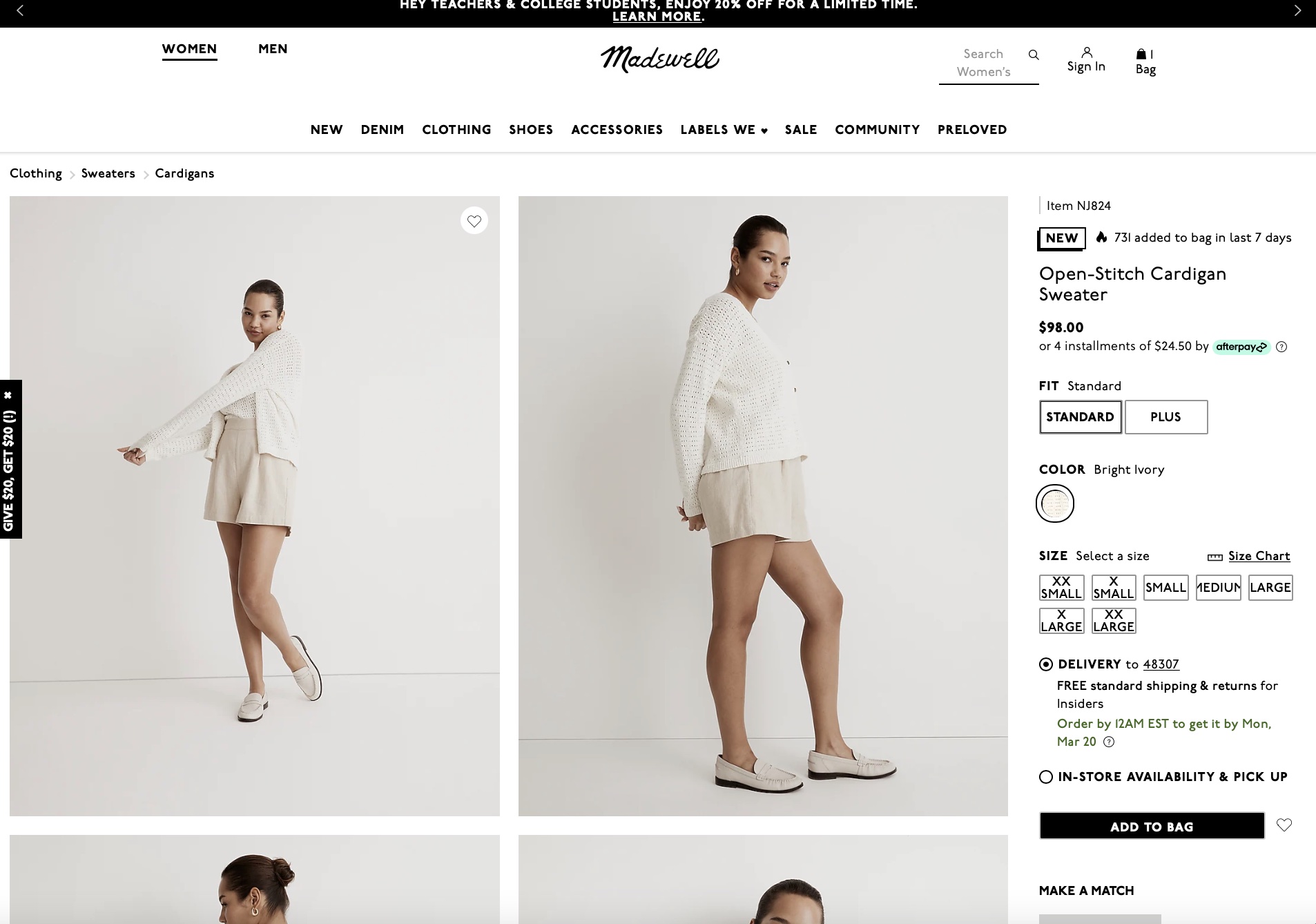
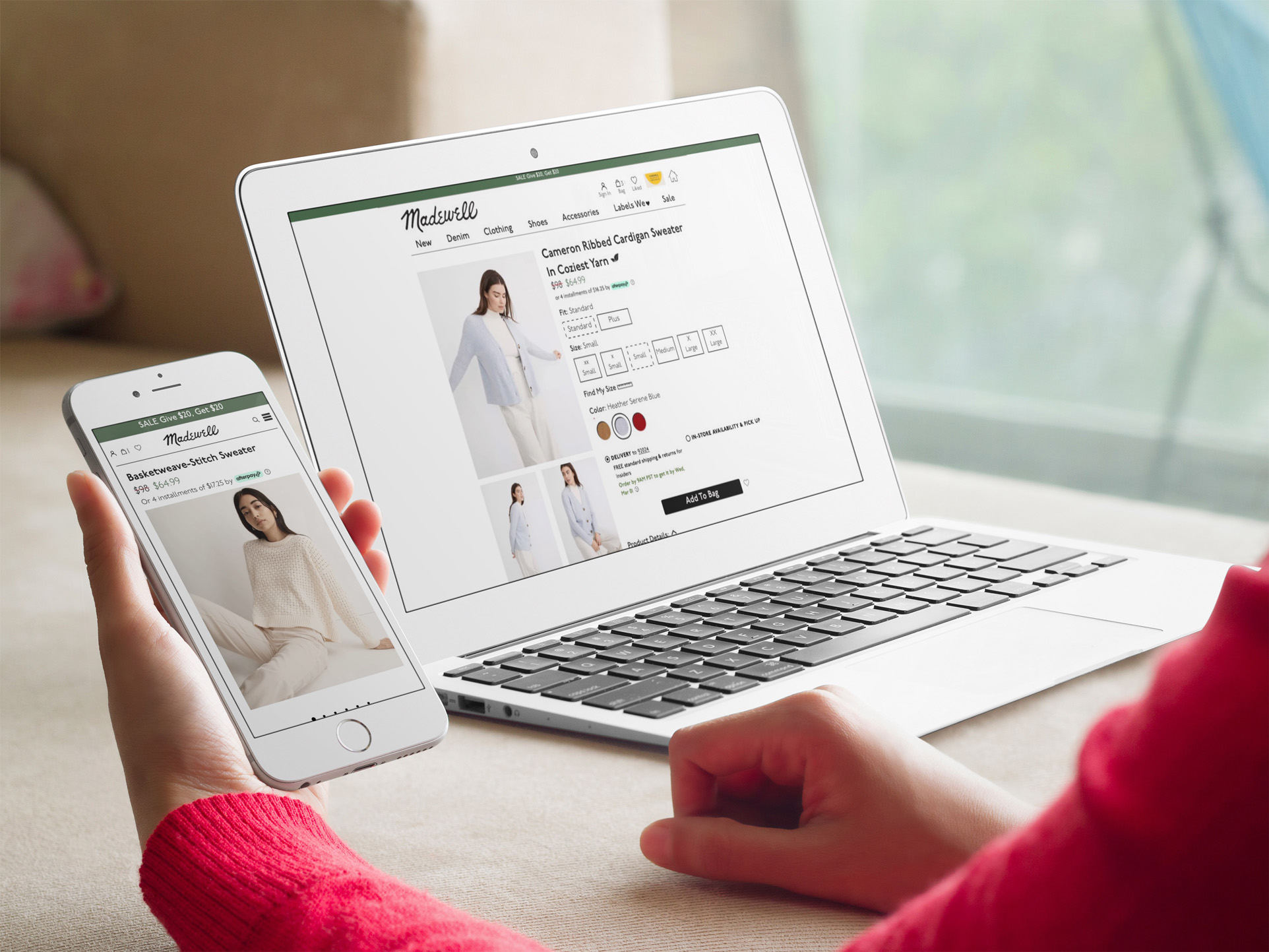
When a product is being viewed the information is overcrowded, and too small. As you can see the sizes have no room within their boxes, and this problem could easily be modifying the layout of the photography and text.
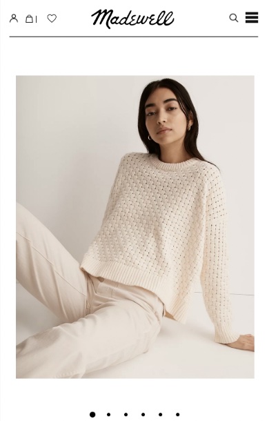
Although the mobile version of the website had similar usability issues, one thing that stood out to me for mobile in particular was the hierarchy of information. When you pull up the product, it is nice to see the image, however I believe the most important information, such as the product name and price should be at the very top.
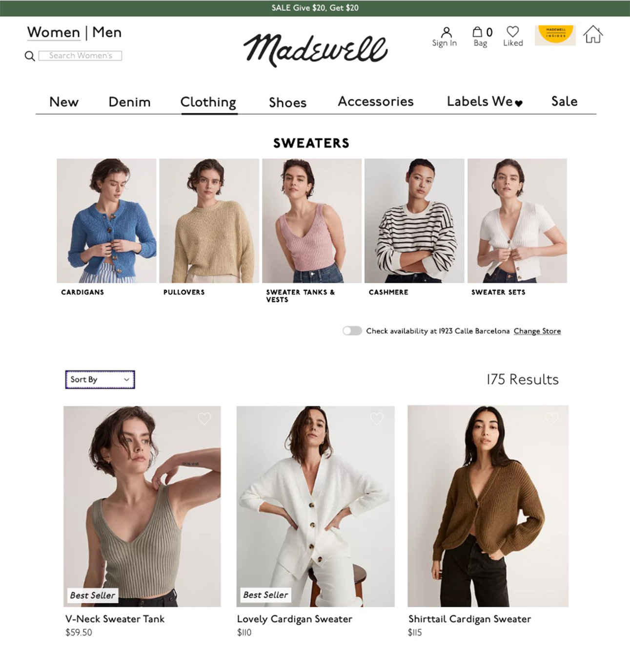
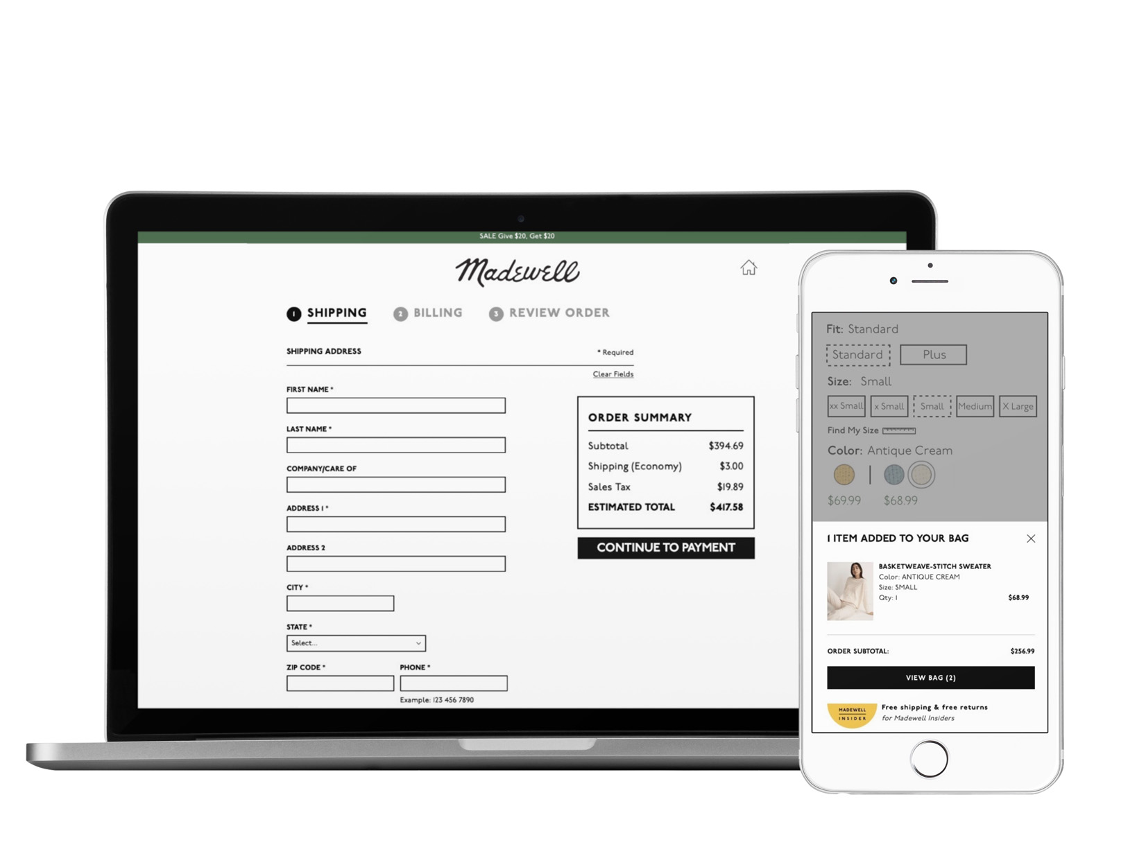
Each page now has the styles at the top, with a small dropdown menu that you can sort color, size, and price. This keeps each page consistent, and reduces unnecessary information. I eliminated the excess information by only revealing it if you select create account. If the user prefers to continue as guest that option is easily available to them.

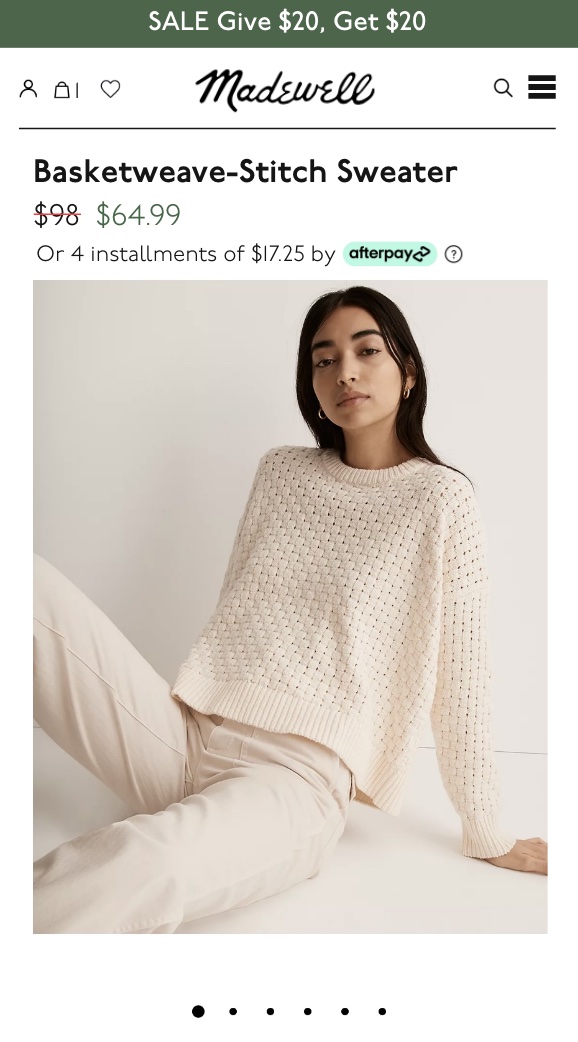
On the mobile version I included the product name and price at the top of the photo which allows you to immediately see the most important information without losing the image.
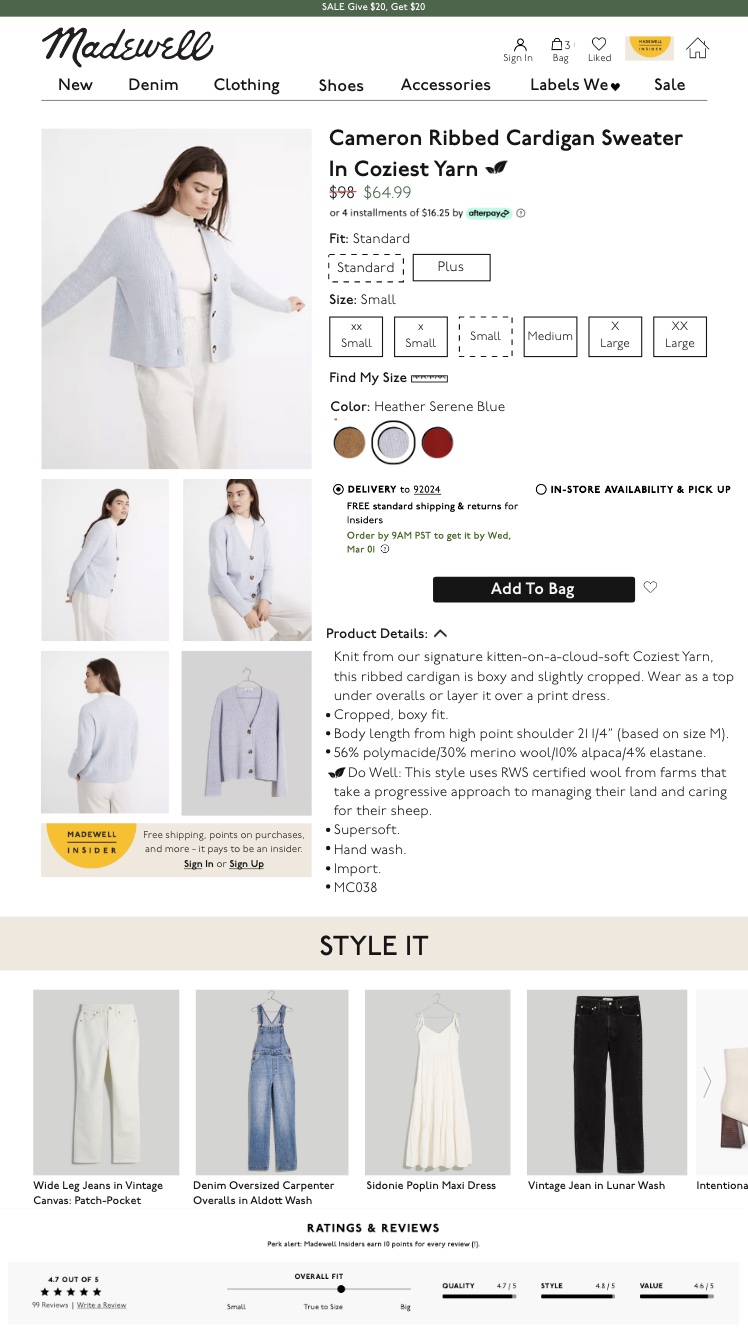
I gave the information space to breathe, and be easily read. By reducing the image sizes to display one main image at a time it leaves much more space on the page for important details.
OTHER IMPROVEMENTS
I added two features that improve the UX design of the Madewell website. The first one includes the use of color to guide a user throughout their journey. The green it is associated with sales, the is blue corresponds with the denim section, and the yellow is the color for memberships.
The second improvement I added is the "Style It" section. This section helps people find items to compete their outfit based on the product they have selected. The original site started with an overall theme of finding your style, but was done so in a sporatic unorganized way. I decided to simplify that feature and add a specific section below the product that shows items that can be paired with your choice. This design choice will engage customers, and get them browsing other pieces on the site.
USABILITY TESTING
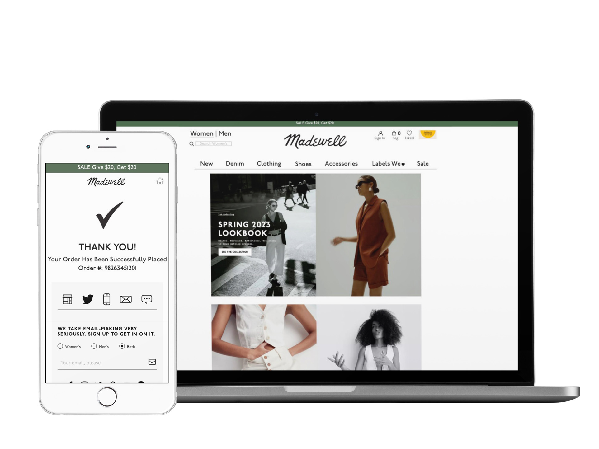
By gathering users to test the website helps boost the Madewell websites satisfaction level because the errors that had been identified were fixed accordingly. The feedback that was received included the fact that there was not clear access back to the homepage on every page. It was also pointed out that on the "Thank You" page at the final stage of checkout was lacking some information users would have liked to see, such as the estimated arrival time. These are key elements in any website that had been missing, and usability mistakes were easily avoided by user testing.

Need a Designer?
Let's work together! I would love to hear about your project and see if we are the right fit. Send me a message, and I will be in touch shortly.