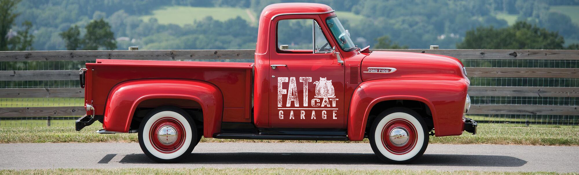
Fat Cat Garage is a vintage car shop located in Reno Nevada with a unique twist. The owner has many furry employees who roam the property giving the garage its unique name. Although recently built, this garage is not only home to many cats, but also to many vintage cars that are to be, or have been restored.
FAT CAT GARAGE
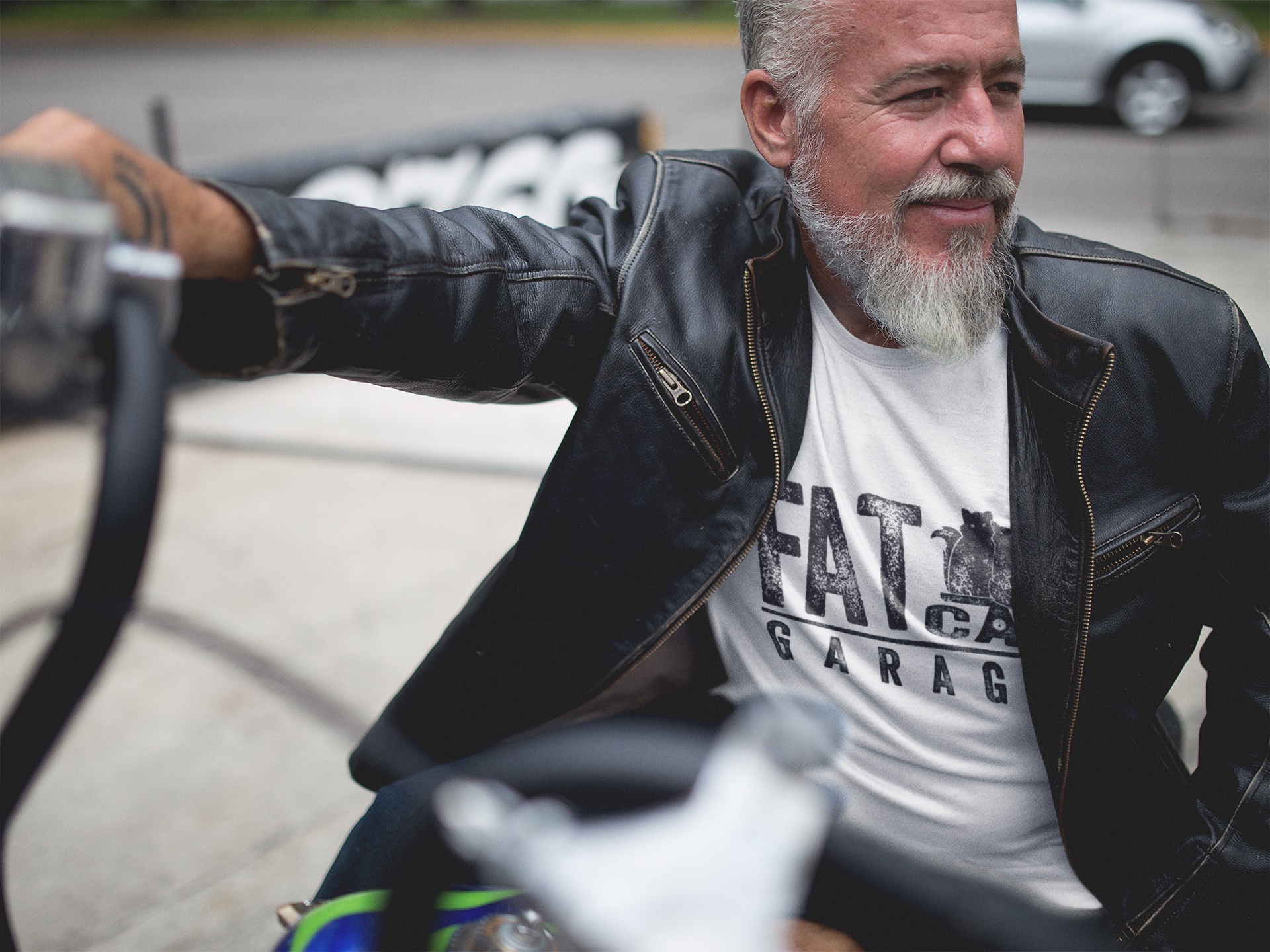
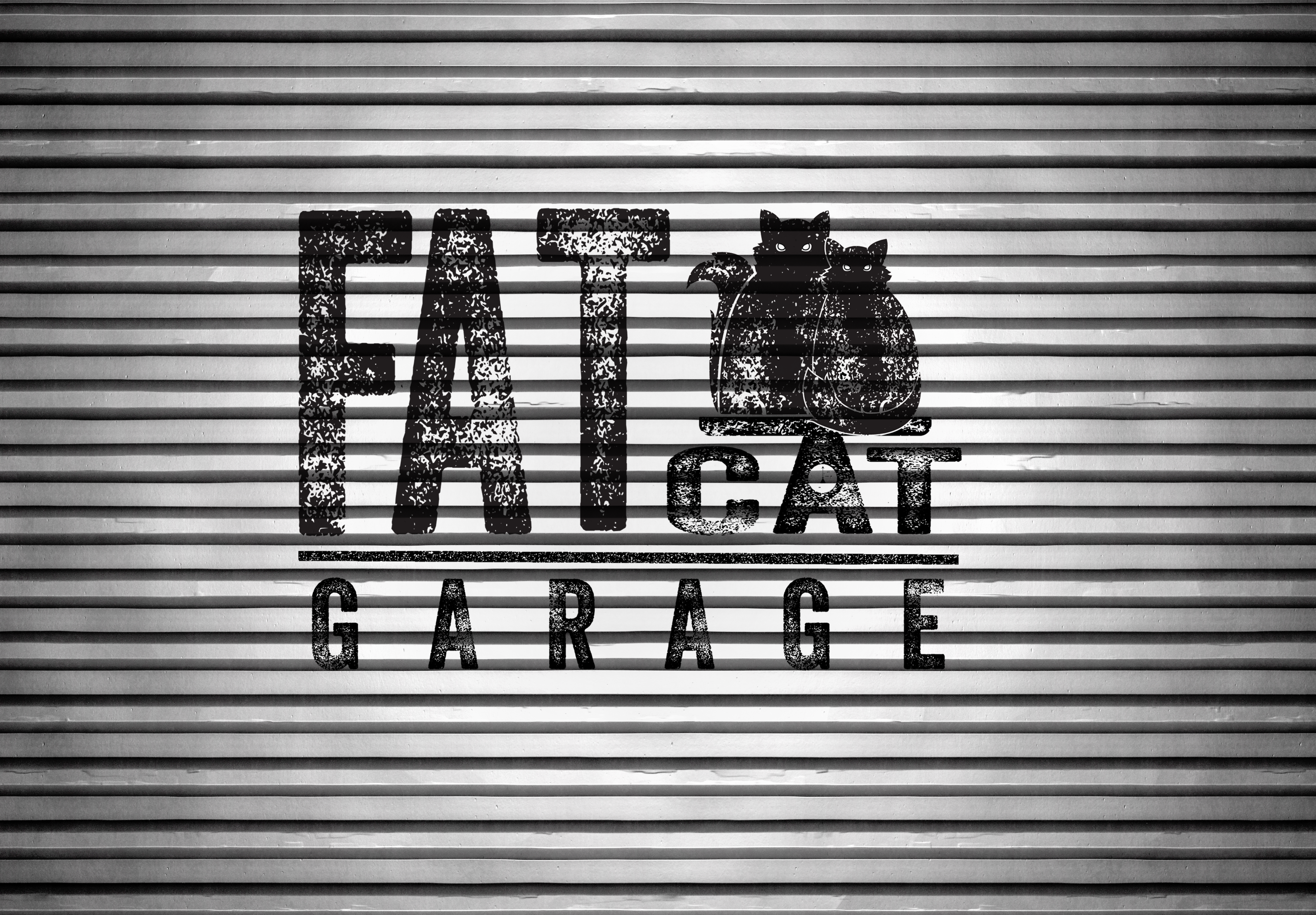
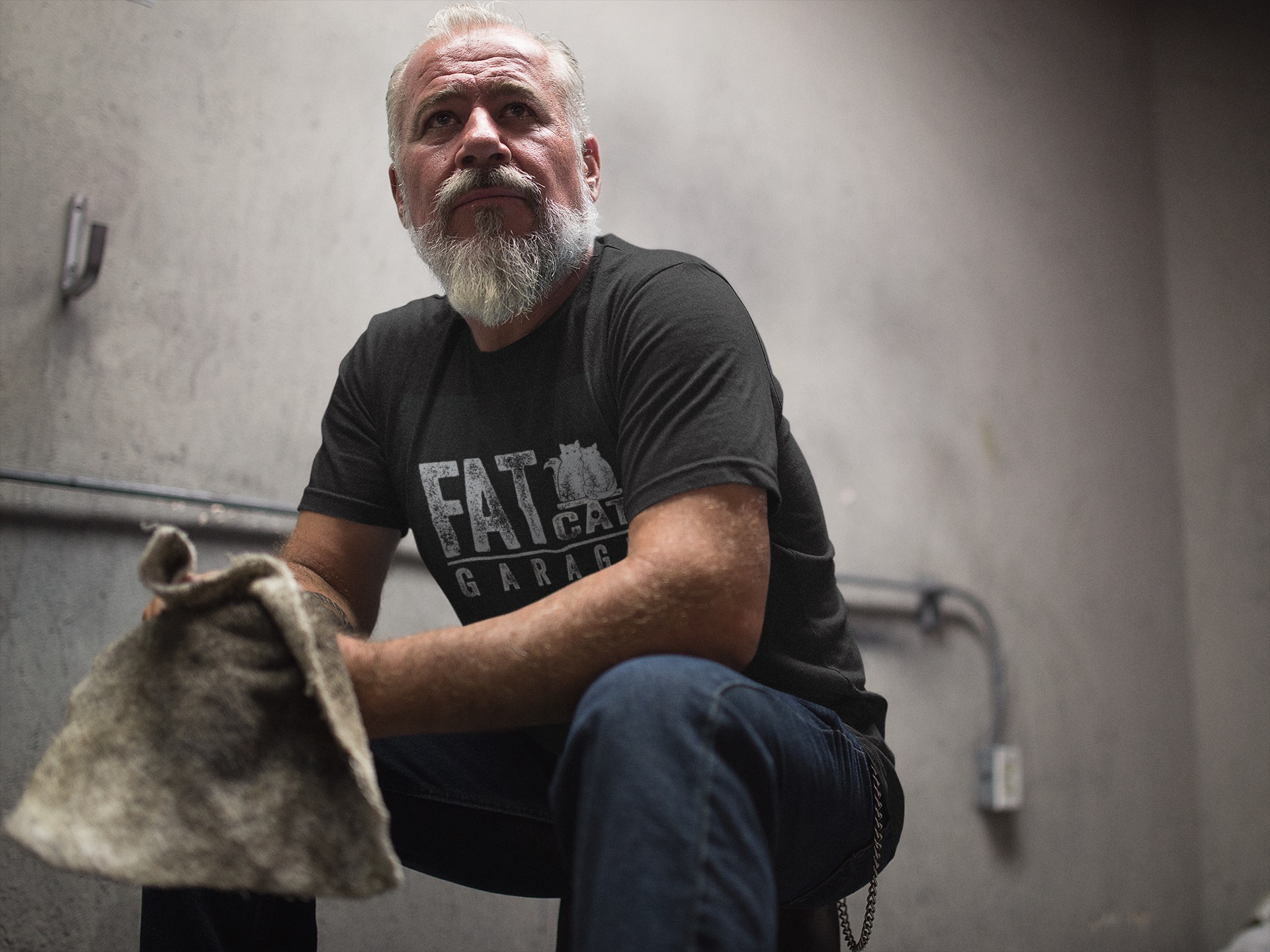
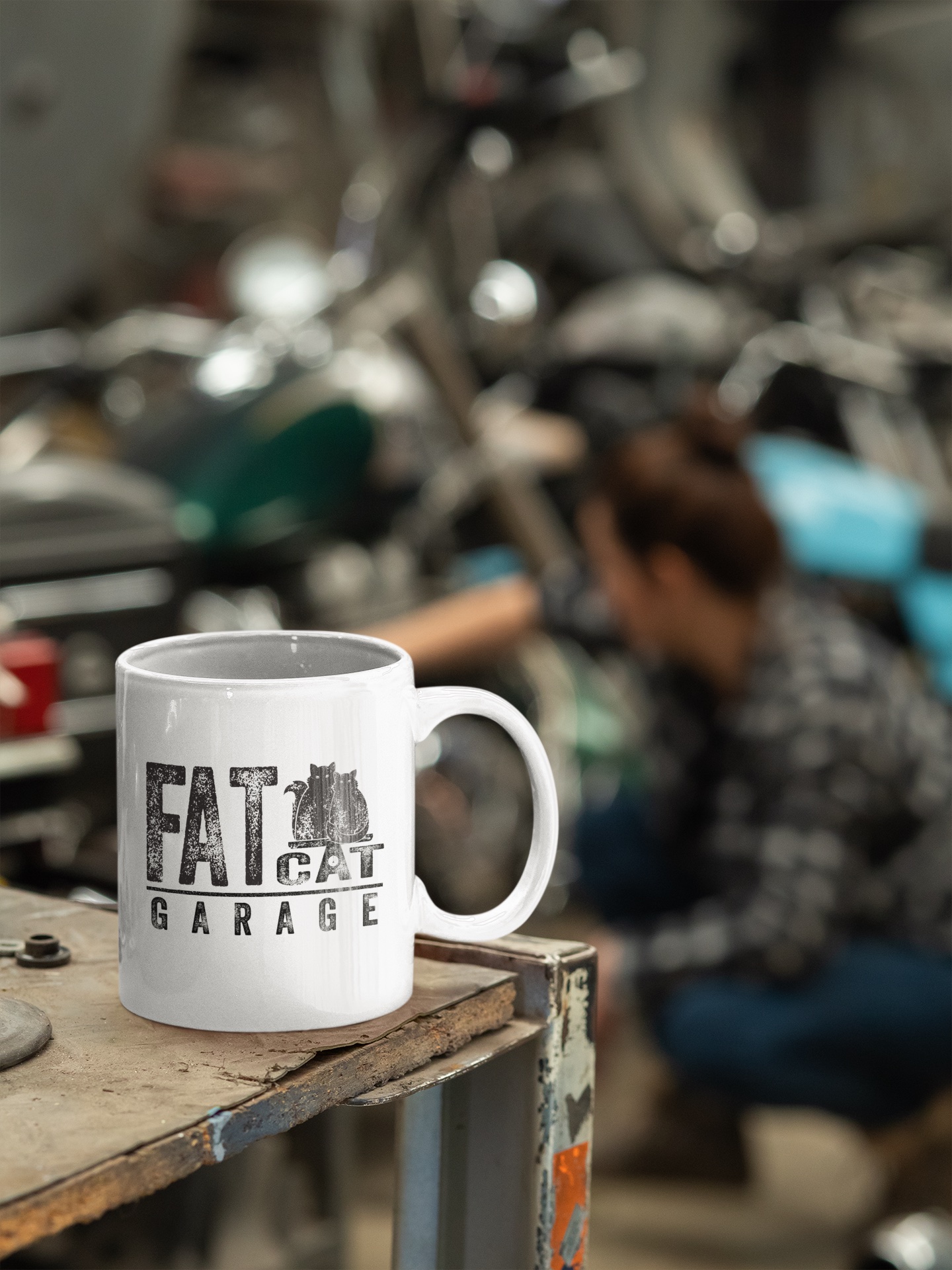
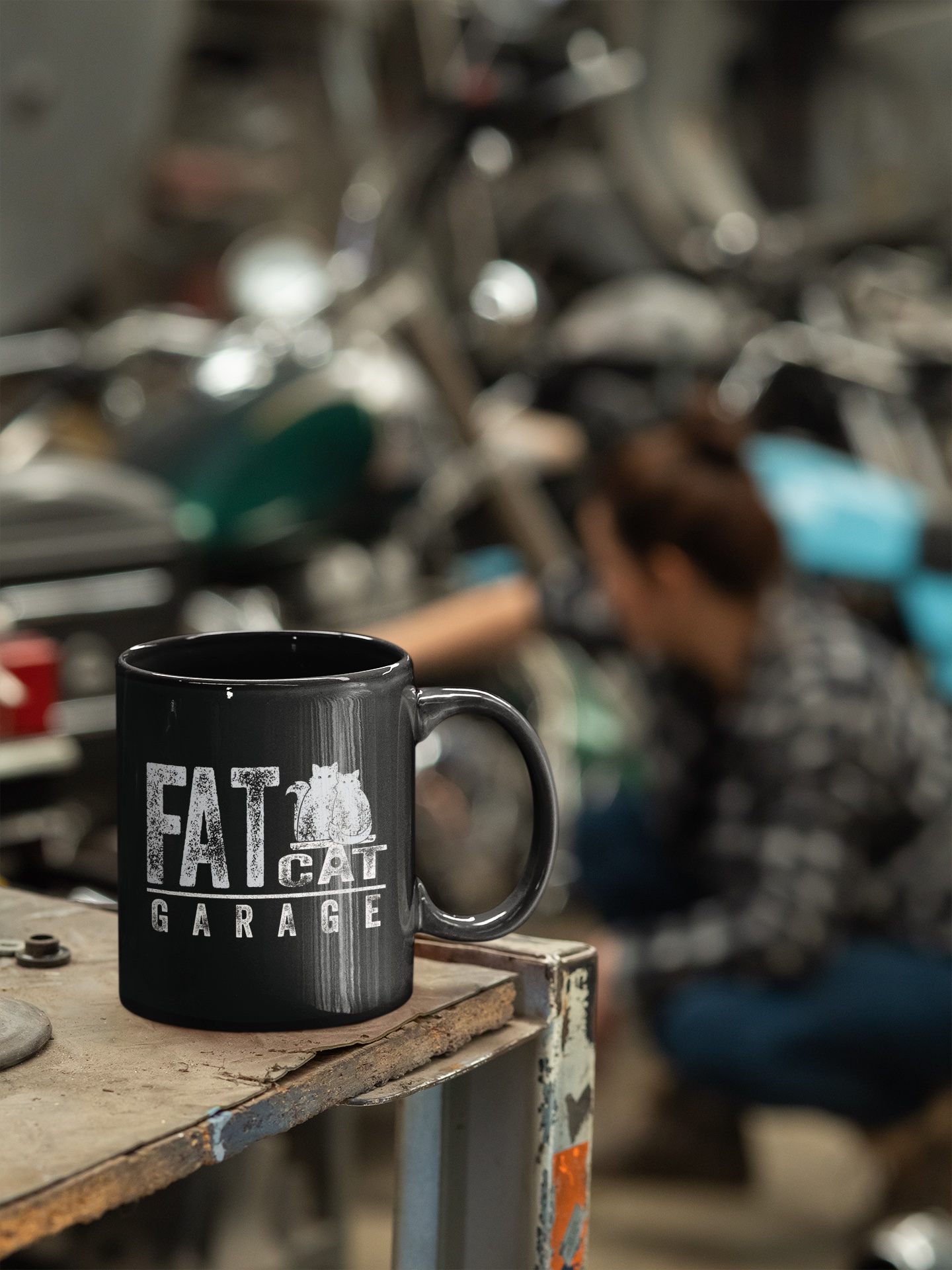
The goal of this logo and brand design was to create a vintage garage feel while also remaining timeless like the cars it holds. I also aimed to highlight its unique cat attribute to be a recognizable icon among the community. Being such a distinctive garage it was important to embody its characteristics in the logo and distinguish it from your typical garage.
LOGO DESIGN
Before starting on this logo, I visited Fat Cat Garage to be able to fully understand its essence and to meet some of the cats that give it its name.
The main essential feature requested by the client included two Rag Doll cats resembling a few that roam the garage named Nicos and Oliver. As I was visiting I noticed cars were not the only vintage collection the client had. There is a collection of vintage scales on the property which I thought could be a fun element to play into the name Fat Cat Garage. I had to take advantage of this fun play on words and include it in the logo.
A vintage font is key to any classic garage sign, so I decided to use a grunge textured font that coincides with the theme. For the cats, and the scale in the logo I had to hand create the texture to match the font to fully give the logo its vintage feel.
The main essential feature requested by the client included two Rag Doll cats resembling a few that roam the garage named Nicos and Oliver. As I was visiting I noticed cars were not the only vintage collection the client had. There is a collection of vintage scales on the property which I thought could be a fun element to play into the name Fat Cat Garage. I had to take advantage of this fun play on words and include it in the logo.
A vintage font is key to any classic garage sign, so I decided to use a grunge textured font that coincides with the theme. For the cats, and the scale in the logo I had to hand create the texture to match the font to fully give the logo its vintage feel.

When considering the perfect font for the Fat Cat Garage it was important that it had the right feeling for the theme.
The Vaneer - Three Regular font was a great fit for the vintage theme. The rough texture gives it that timeless on brand garage feel.
The Vaneer - Three Regular font was a great fit for the vintage theme. The rough texture gives it that timeless on brand garage feel.

The cats were uniquely created to resemble the Rag Doll cat breed as the client requested.
The challenge was to create a texture that resembles the one that is applied to the font. To accomplish this look I hand created shapes resembling the grungy vintage appearance.
The challenge was to create a texture that resembles the one that is applied to the font. To accomplish this look I hand created shapes resembling the grungy vintage appearance.
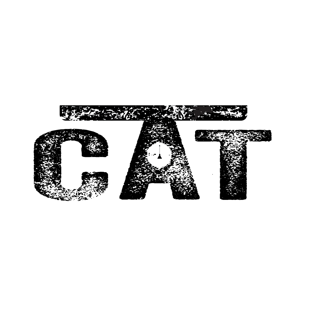
The perfect fit for a play on words, the scale element. Since this was such a distinctive feature it seemed fitting to include in the logo.
At first I was struggling to see where a scale would fit within the design and text. However, the A in cat naturally created a perfect base for a scale.
At first I was struggling to see where a scale would fit within the design and text. However, the A in cat naturally created a perfect base for a scale.




Need a Designer?
Let's work together! I would love to hear about your project and see if we are the right fit. Send me a message, and I will be in touch shortly.