Wayfarer Bread & Pastry is a local San Diego bakery located seaside in the neighborhood of Bird Rock. The bakery is dedicated to making artisan craft bread and splendid pastries served hot and fresh to the community, but exceptional baking is merely the outcome of the story and values that define the business.
WAYFARER BREAD & PASTRY
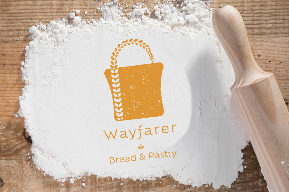
The goal of this logo and brand redesign was to modernize it in a way that incorporated the unique personality of the business and the people who make it special. For this project, I worked to understand its voice.
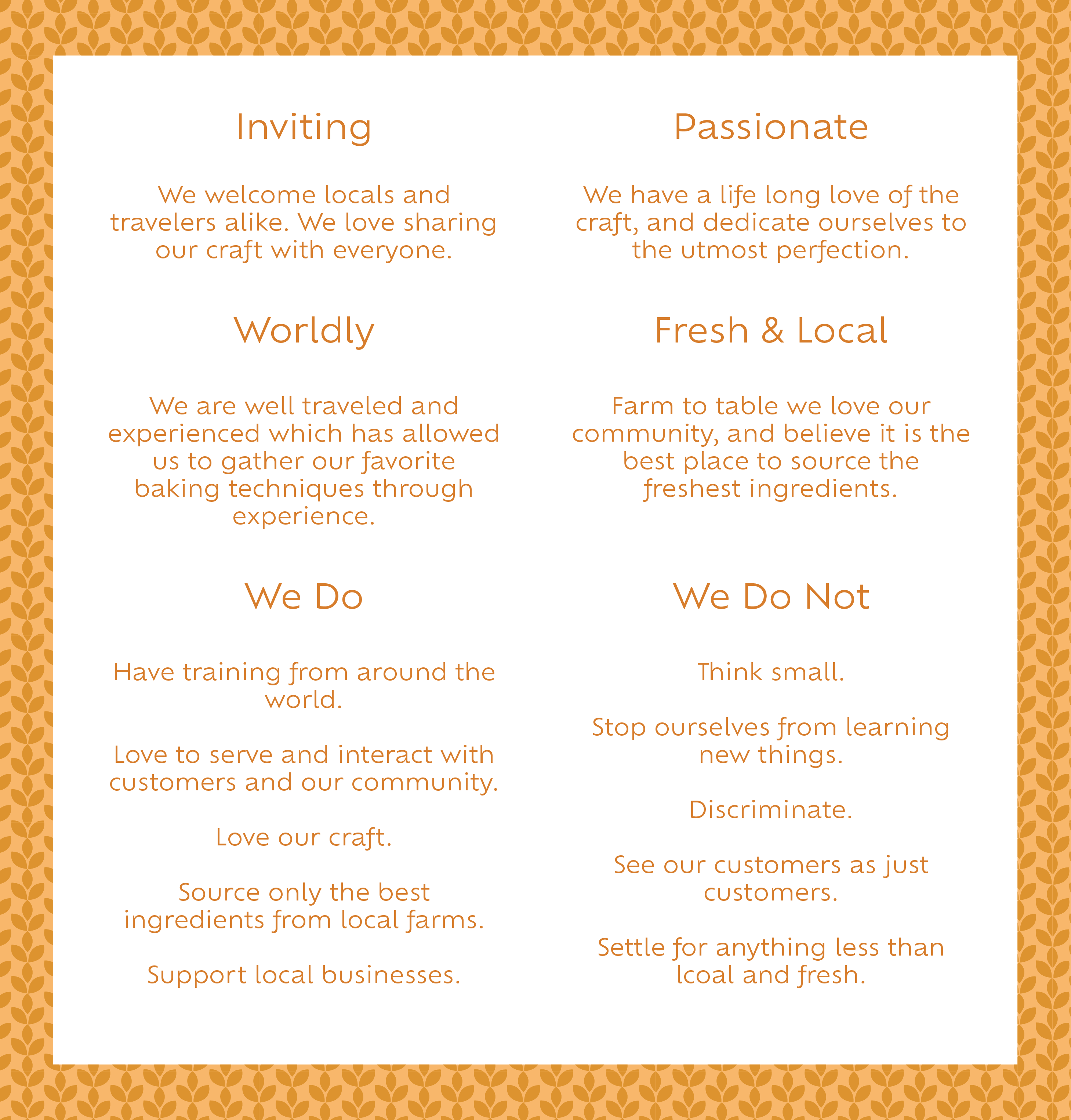
WAYFARERS VOICE IS...
The following concepts were gathered for incorporation into the Wayfarer Bread & Pastry rebranding.
LOGO & COLORS
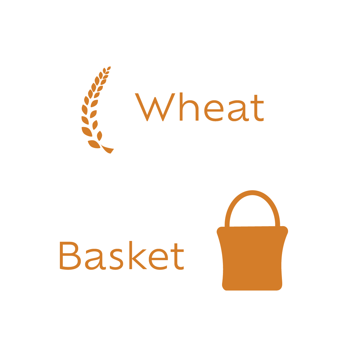
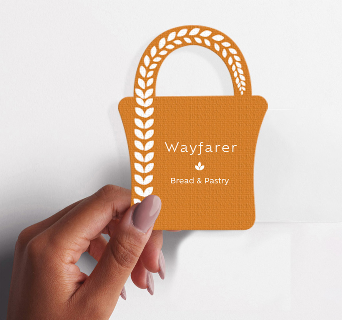
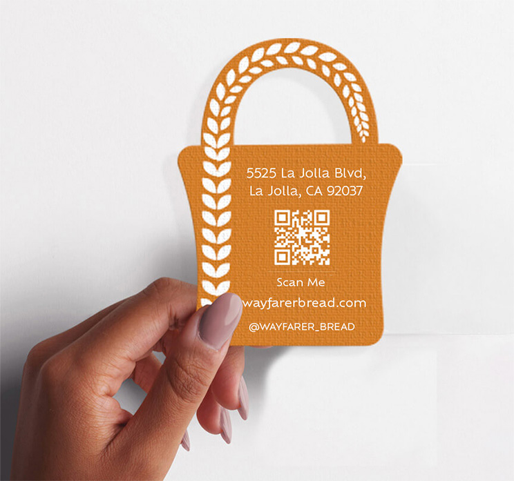
Representing harvest and hearth, wheat is the foundational ingredient in Wayfarer's products. As the basis of its freshly baked bread, wheat naturally had to be a part of the logo.
The basket universally represents a vessel for carrying food, and more specifically bread. In the case of Wayfarer, it represents the travel and training undertaken to bring unique and special artisan bread to the community.
The color palette is designed to make people feel warm and welcome when they come into the bakery. The colors are rich, but also vibrant enough to offer a distinct and recognizable brand in the scenic beach community.


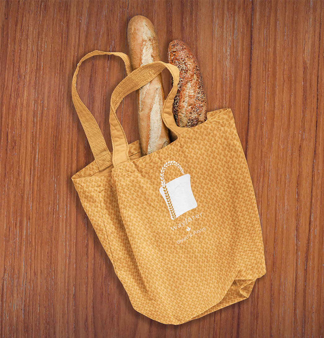
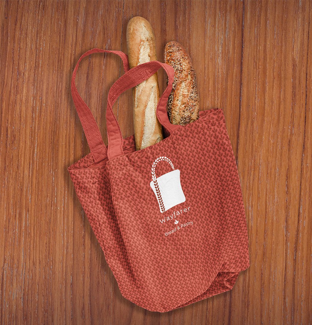
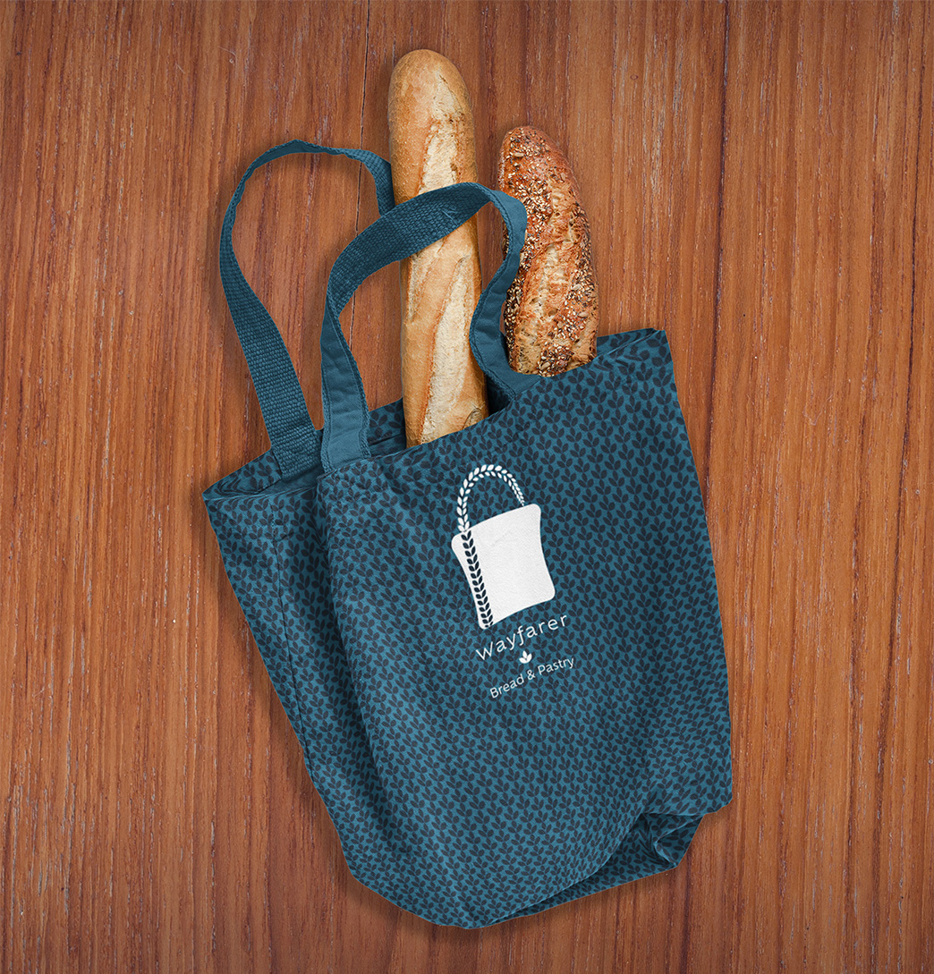
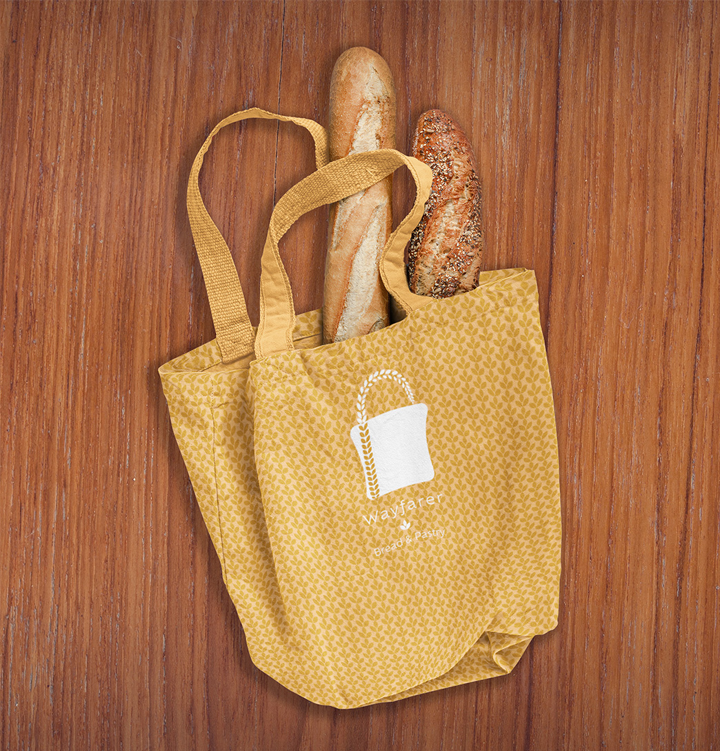
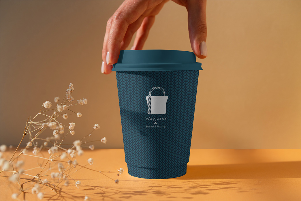
Here we have our colors in fun wheat patterns... because wheat love it!








Need a Designer?
Let's work together! I would love to hear about your project and see if we are the right fit. Send me a message, and I will be in touch shortly.